Wayfinding adventures in super graphics

We’ve been using our own bespoke designed super graphics for a long time as part of the process of developing interior schemes.

At one time they might have been viewed as stand-alone features adding a brand identity to the building but increasingly (if not completely so) these super graphics are an important part of the overall wayfinding strategy. They work alongside the paint finishes helping to identify areas, create landmarks and way points as visitors circulate through a building.

Graphics and visual imagery in general is readily available through stock libraries online but if you look closely you will often observe the same stock images appearing time and time again. We believe that schemes deserve better.

At the Childrens’ Day Unit (Milton Keynes University Hospital) we designed a complete suite of playful graphics based around the theme of the farm which were installed full height on walls throughout the unit. Graphics, flooring and wall finishes were all tuned to work with eachother.

At Birkett House SEN school the headteacher said that there was a noticeable improvement in the way that pupils independently moved to their classrooms rather than being escorted. This was in no small measure due to the way in which we used the finishes and graphics to help make the building more legible to a non-literate population.

Fill a pool with water – then just add colour + light

Colour and light at Perdiswell Leisure centre which was completed in December 2016

The initial brief of designing a large scale coloured manifestation for the pool hall was expanded to include various other features around the centre as well as advising the client on all the interior finishes.

Main contractor Speller Metcalfe, client Worcester City Council.


Great feedback on engagement sessions

engage-wshop

We recently ran some engagement sessions for a large CAMHS (Child and Adolescent Mental Health Service) scheme that we’re working on.

Here’s some lovely feedback we received from a senior member of staff;

“The latest service user art workshops took place on 14th – 16th October. Eric Klein Velderman facilitated the workshops with service users in order to develop the final designs for the new building through consultation and creative engagement with our service users. These designs included a number of integrated and graphic based artworks for the ward dining rooms, ward games rooms, the sports hall, education & therapy entrance,  café, main entrance and each ward staff base and ward entrance.

The workshops saw up to 30 service users taking part each day across all units within the Adolescent Pathway. There were very positive reactions  from the service users when Eric showed them the overall scheme with comments such as “That’s going to be wicked” and “That’s cool that we’ll have the same staff (!), what will the bedrooms look like?”

Eric skilfully managed to tailor each workshop according to the different abilities & needs of the young people, grading and selecting activities depending on cognitive abilities, their motor skills and communication abilities. He used a variety of teaching approaches including demonstration, modelling, verbal instructions, physical and verbal prompts in order for the young people to be successful and engage in the activity to complete an end product. He introduced all the workshops, explaining the aim of the workshops and putting this into the wider context of the overall art plan for the new building. This sparked enthusiasm for the project from both the staff and young people.

He tailored his communication skills to the needs of the young people; for example when working with the autistic population, simplifying instructions given and planning 3 step tasks where there was immediate cause and effect. He engaged brilliantly with the service users, engaging and consulting with their ideas, expanding on their ideas and praising them throughout. He demonstrated excellent therapeutic use of self in his approach to engage service users, responding with humour to young people who engaged in playful ‘banter’ but with others being very gentle, quiet and calm to put the young people at ease”.


An explanation of the colour scheme at Ysgol Y Gogarth SEN

We were recently asked to provide a summary of the principles that we used in developing the color scheme at Ysgol Y Gogarth for a case study that Akzol Nobel are producing. Below is an excerpt from our report;

The starting point for the scheme was to develop a colour palette which drew inspiration from the surrounding external Welsh landscape with the proximity of the sea, coast and mountains all within eyesight of the new school. This was linked to the focus that the school had on encouraging their pupils to get involved in numerous outdoor activities including climbing, skiing and canoeing. On my first visit to the old school I was struck by the outward looking ethos of the school and its daily approach of encouraging physical interaction with the landscape of the area.

There was a parallel dialogue with the school about how the internal finishes would influence and contribute to positive interaction with their pupils. One particular concern was that the school wanted the Ground floor (the entry point at the start of the start of the school day) to be a place of calm especially for their Autistic spectrum pupils for whom discordant colours and abrupt floor transitions would pose issues.

Another consideration was the wide spectrum of abilities within the school including those pupils with visual impairment needs as well as low levels of literacy. These factors were important when thinking about wayfinding within the new building as the use of signage would be limited as a consequence whereas the use of visual cues such as colour and texture would be emphasized.

As a result of considering all these elements the school was zoned into distinct thematic areas of ‘Sea’ for the Ground Floor and ‘Mountain’ for the First Floor with the ‘Forest’ acting as the transition points between those zones. Externally a ‘Coastal’ theme was used to bind together the various outdoor elements. A palette of shades of sea blues was used on the Ground floor to help develop a sense of calm whilst on the First floor stronger shades of mountain greens and purples were used to emphasise the energy and seniority of pupils as they progressed through the school.

Another guiding principle for the colour scheme was that all the end users would benefit from the scheme having a strong visual logic. A sense of repetition would be used to help locate people as they moved around the spaces. For instance aside from the differentiation between the ground and first floors, the core spaces such as offices and medical rooms were allocated their own core colour scheme. This was replicated across all the floors and was done to help confirm the differences and transition from and between pupil and administration spaces.

The scheme used the principle of feature wall colours contrasted with Wiltshire White on non feature walls. The feature wall colours were used partly as a tool for wayfinding; blocks of colors which guided people through the building, and also as a way of defining the various zones of the school. Within the stairwells large 6m high composite images of birch trees photographed at different times of the year were used to transition between the Ground and First floor. The principle staircase used by most people throughout the day combined a strong feature wall colour with a polycarbonate wall with seaweed graphics. Colour was used here to pull people up the stairs and onto the next floor.

Attention was paid to sightlines within the building. Although a relatively deep plan building the architects were able to maximize views out of the building towards the landscape. How many schools have a view of the coast at the end of a corridor? This principle of creating visual events was bound into the wall colour scheme; block colours were used to provide ‘destinations’ and ‘signposts’ to other parts of the building.

Ysgol Y Gogarth

Ysgol Y Gogarth

Ysgol Y Gogarth

Ysgol Y Gogarth

Ysgol Y Gogarth

Ysgol Y Gogarth


Ysgol Y Gogarth

Ysgol Y Gogarth


MK Hospital design developments

Sometimes it seems that you’ve been very quiet when in reality you’ve been very busy working on a whole series of concepts.

Milton Keynes Hospital have commissioned us to develop ideas for both the Children’s Wards as well as other parts of the hospital. It follows on from a previous commission to create graphics for Ward 4. Working with the Arts For Health team we’ve been developing a load of very exciting proposals of which the Nature Trail concepts below are a small sample of the project development.

A key challenge for the scheme is to ensure that our programme connects and integrates with the larger hospital maintenance regime as there are some interesting opportunities that can arise from that collaboration.

Our next step is to run some focus group work with young people to gauge their reaction to the current proposals as well as gather their ideas .

You can find out more about the excellent work of Arts For Health here

mk-nature walk mk-nature walk mk-nature walk

Getting all immersive!

The brief was to develop an immersive technology scheme for Ysgol Y Gogarth that would provide a wide spectrum of pupils and especially their ASD pupils with a series of rich immersive experiences facilitated by accessible controls that all the staff could use. A challenging brief naturally!

There were a number of locations where this technology would be implemented. Of course as you’d expect there were sensory rooms. The traditional model is to create soft play spaces with bubble machines and projectors. At Gogarth we wanted to take it a step further so we designed spaces where all the finishes were white and M&E was kept to a minimum. Our technology partner, OMI Interactive Ltd, who incidentally provided a fabulous personalised service then filled these spaces with ceiling mounted projectors that were used to animate the walls and floor. Soundbeam equipment enables pupils to create music but those beams also double up as a controllers for all the projected effects. We also used LED lighting to graze all 4 walls and all these effects were controlled with a single iPad wall mounted controller thus keeping switches to an absolute minimum. From a classroom teacher’s perspective; the practical value of being able to focus on the experience rather than managing the curiosity of their ASD pupils for the switches was paramount in our design development.

As you’d expect; the main problem with technology is that it’s very quickly superseded. An attraction of the OMI software is that it’s incredibly intuitive and configurable. New apps and scenes can be added and every single aspect of the experience can be duplicated, modified and embellished by staff as they go along. It’s basically not unlike editing your WordPress site. The iPad controller was developed as direct response to our brief at Gogarth and took some of its usability cues from a click wheel wall light controller developed by Phillips. They also provided some great staff training days for the nervous non-techies after the school took possession of the building.

Moving on to other parts of the school; the hydrotherapy pool space was another area where we wanted to maximise the immersive technology. Here we had input from Crown Stage Ltd (sound and lighting), Modular Ceilings Ltd ( fibre optic stretch ceiling) and Phillips wall colour blasters provided by Architainment Ltd. The trick, which we managed to achieve through a great deal of coordination, was to control all these separate elements through one mobile flight cased controller rather than a multitude of zappers and wall switches.

The school main assembly hall was another area that needed some delicate design coordination. Typically school halls are multi-functional rooms. The new hall at Gogarth enables all the staff to gather for team briefings: a first. Of course the weekly school assemblies are held there and it also acts as an overspill for the dining area next door as well as a performance space. The biggest concern, at least for the headteacher, was that (as a minimum requirement ) the data projector image throw would be bright enough for children to see in the back row seating. Not an unreasonable request but hugely compromised by the massive ceiling roof lights and borrowed light from an entire glazed end wall. As it was 2 large data projectors and motorised black-out blinds (Maple Sunscreening) gave the headteacher 2 massive motorised wall mounted screens for projection. Crown Stage were tasked with providing all the equipment for this space. The result: a suspended lighting rig that your local theatre would give its eye teeth for, stow-able stage blocks, an integrated sound system ( they’ll be able throw some great parties here) , those 2 big projectors and screens and 360 degree/ 7 metre high perimeter black out drapes. It’s an amazing space… a large enough space to inflate the spectacular immersive igloo provided by 4D Creative. Plug it in and the ripstop igloo rises up from the ground to create a child friendly space. Go inside and your senses are overloaded with sound, lighting and projection – all portable, all contained within the mobile flight case that it packs down into. The speakers incidentally connect to the control box via its own LAN so no cables to trip you up.

I’ve very nearly forgotten to mention the Music room – basically a classroom sensory room with the same OMI kit mentioned earlier. Early on the proceedings the music teacher was asked to provide a wish list; the only item on it was an iPod! Well as it turned out; we provided fixed and portable sound beam equipment, interactive wall projection and integrated ceiling mounted speakers – oh, and an iPod.

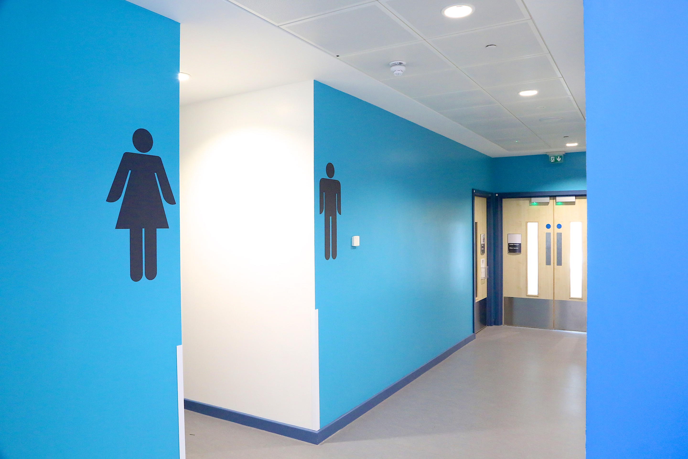
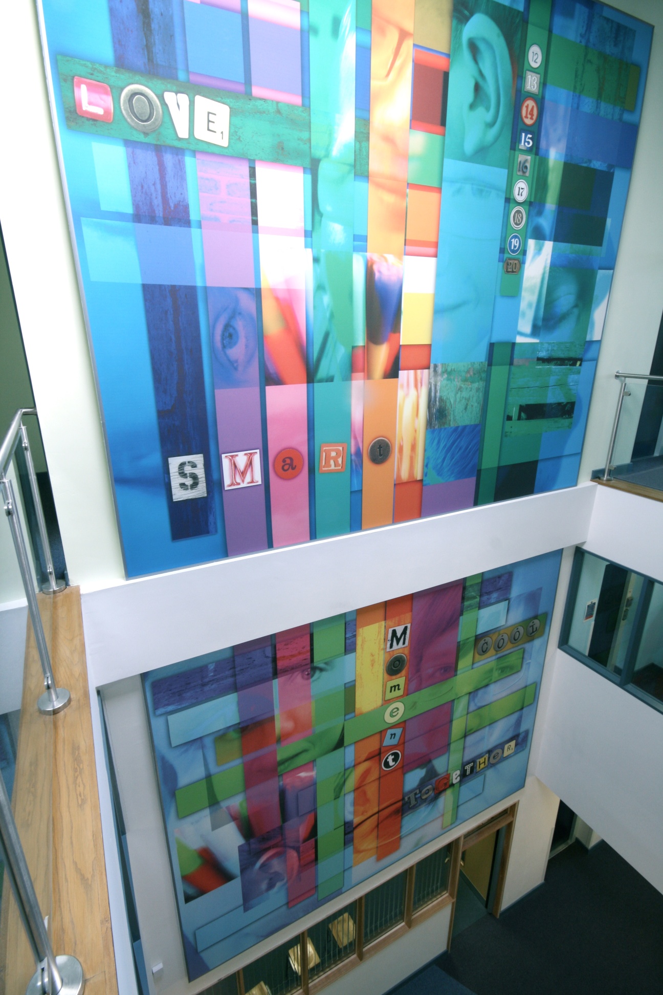
Aside from rooms within the school we also deployed lighting technology around the circulation areas. a colour changing LED cafe sign, controllable LED lighting for the main staircase to the first floor and an interactive touch LED wall using sensacell modules supplied by Architainment completed the immersive set up.

As you’d expect; the commissioning stage after handover is crucial. There were glitches and it reinforces the importance of having suppliers on board who have the flexibility to come back to sort out, adapt and explain the systems. We were pleased to enjoy good follow up service from all the suppliers and also noted that they were keen to promote the work they had done at the school which is always a good sign.

Some of the biggest lessons that we derived from designing this scheme was the critical value of coordinating all the various suppliers in order to avoid duplications and complication. Going the extra mile with the school to understand the needs, explore potential solutions and even go to other installations to assess were all important steps. One stand out moment was a coordination meeting (one of many); in a small site office meeting room filled with light fittings and other bits of kit, getting hotter and hotter, mixing and matching different elements with everybody contributing in the spirit of a technological Columbus – charting the new world.

Once it was all installed – there was the moment of sheer delight from an ASD pupil when they realised that their feet were triggering different reactions from the floor projection. Magic!

Immersive technology - Gogarth

Immersive technology - Gogarth

Immersive technology - Gogarth

Immersive technology - Gogarth

Bristol Royal Infirmary commission – not quite!

Sadly this is going to be one of those schemes that got away (just).

But because we liked our initial concepts so much we thought we’d share it any case. The scheme which is being managed by Willis Newson called for designs for the entrance to the paediatric wards as well as super graphics for the corridors.

We proposed that the entrance which is compromised by unauthorised car parking and feeling somewhat ‘out of the way’ would be enhanced with a series of metal powder coated tree artworks that would wrap around and over-clad the existing rather banal concrete columns. A woodland theme which linked to the outdoor trail would be emphasised with cast bronze birds on the new bollards to help prevent the inappropriate car parking. On entering the wards we proposed that the woodland theme would be extended as series of friezes depicting trees and leaves as well as various creatures to help animate the spaces and direct visitors through the (endless) corridors. We were keen to explore how different materials could be used to transform the circulation areas and considered vinyl film as well as jet cutting substrates such as the wonderful 3Form resin sheets, formica and various hygienic wall cladding systems.

If you’ve got a similar scheme and would like some advice then why not give us a call.   BRI-corridor graphics-1b1c 01-BRI-cam8 BRI elevation

Project Fitzroy commission appointment

Project Fitzroy logo band We’re really pleased to announce that we’ve been appointed for a design commission with St. Andrew’s Healthcare to work closely with their architects (P+HS) to explore, develop, design and deliver a coherent visual framework for their new build scheme. An integral part of our role will be to design way-finding graphics, wall super graphics and systems for the display of service user art. The client has also given us the freedom to exert a creative influence on the overall design process and enter into a positive dialogue with the architects. We will be identifying opportunities for design interventions that are integral to the design of the hospital, within the building, interior design and potentially within the landscape. This could include working with the architects on colour and finishes within the building if deemed appropriate.

The new build development will be a Secure Adolescent Mental Health and Learning Disability Service Unit in Northampton.

Work starts on this scheme from this October onwards with the scheme completion set for March 2016.

More about Willis Newson here and P+SH architects here


Meadows SEN acoustic digital banner

OLYMPUS DIGITAL CAMERA Meadows SEN 26 (1)

Continuing the theme from the earlier posting. This was an acoustic banner produced with Meadows SEN school as part of their new build programme. Rising up over 2 storeys; the banner is approximately H7m x W5m and has been stretched over a special aluminium frame supplied by Service Graphics.

Y11 students took part in ID – identity workshops that explored positive self images as well as describing motivational words. The artwork was conceived as a woven structure of interlaced strips of colour and photos of the actual participants which taken as a whole represented the diversity of the pupils. Taking a self-portrait and then cutting it up was for some quite a challenging experience. Some of the pupils on the more extreme end of the autistic spectrum were at pains to re-assemble the images so we spent quite a lot of time talking about order and disorder.

As ever in this sort of work; the conversations are as important as the outcomes.

The GOG sculpture installed and unveiled

gog detail

gog in situ

gog detail2

The GOG sculpture was developed as a feature that would greet pupils as they first arrived at the school.

Initial design sketches played with the form of the letter ‘G’ which was then extended to thoughts about curling waves and sea shells due to the proximity of the school to the coastline. The overall spiral shape also has the feeling of movement – a sort of whoosh which reflects the part that the school plays in developing and nurturing these young people.

The final form has been fabricated in 3 parts; a copper section representing the pupils, a stainless steel section representing parents and a base Cor-Ten section which represents the school.  The copper will verdigris over time to develop a mottled copper turquoise finish whilst the Cor-Ten is designed to build up a smooth patina of dark orange rust.

The GOG as it has become to be known was also used to inspire the various glazing manifestations and also more importantly the new branding for the school. See here for more