Wayfinding adventures in super graphics

We’ve been using our own bespoke designed super graphics for a long time as part of the process of developing interior schemes.

At one time they might have been viewed as stand-alone features adding a brand identity to the building but increasingly (if not completely so) these super graphics are an important part of the overall wayfinding strategy. They work alongside the paint finishes helping to identify areas, create landmarks and way points as visitors circulate through a building.

Graphics and visual imagery in general is readily available through stock libraries online but if you look closely you will often observe the same stock images appearing time and time again. We believe that schemes deserve better.

At the Childrens’ Day Unit (Milton Keynes University Hospital) we designed a complete suite of playful graphics based around the theme of the farm which were installed full height on walls throughout the unit. Graphics, flooring and wall finishes were all tuned to work with eachother.

At Birkett House SEN school the headteacher said that there was a noticeable improvement in the way that pupils independently moved to their classrooms rather than being escorted. This was in no small measure due to the way in which we used the finishes and graphics to help make the building more legible to a non-literate population.

Wayfinding in Perdiswell

We designed wayfinding signage at Perdiswell working with our signage partner Dlinexsign ltd which was clear and concise. The signage was implemented both internally and externally and helped to reinforce the identity and brand for the centre. An important consideration was the legibility of the signage for all users of the building.

We particularly liked the Jigsaw ‘Puzzle’ secret fixed sign system from Dlinexsign which allows for easier maintenance. The 5mm thick Frosted Lucite panels are spaced from the wall by 8mm and can be easily unlocked and removed to facilitate interior re-decoration. We used that puzzle design principle to guide the way all the graphics were developed when creating the signage family.

Milton Mouse is getting a makeover

The Milton Mouse Children’s Unit at MK University Hospital is getting a makeover.

The project started with a commission from the Arts for Health team to develop a mural design for Ward 4 on the Children’s Unit. The brief was to develop a feature that would enhance the ward with minimal maintenance implications. We ran some very successful engagement sessions with staff and young patients to create river themed artwork and this was then developed into a wall ‘river’ super graphic which was installed by local sign company Chameleon on the existing wall panels along the main corridor leading into the ward.

The hospital were so delighted as were their patients that a few months later the hospital asked Cantoo to take on a much bigger scheme to help transform the entire Children’s Unit consisting of 2 wards and a day centre unit with a whole range of graphics and other associated refurbishments.

Part of the scheme included producing new layouts for the Play Area, coordinating the installation of some immersive technology as well as designing bespoke fitted furniture and specifying new loose furniture. We also helped to develop an overarching colour scheme which was used as part of the ongoing decorating maintenance programme.

The project has been delivered in phases; Ward 4 was followed by Ward 5 and now we’re about to implement works on the day centre unit, Milton Mouse, for young out-patients.

Project FitzRoy – taking a walk through fields and sky in a brand new CAMHS unit

Today patients and staff are moving into the brand new FitzRoy House CAMHS unit.

We were commissioned by St Andrews Healthcare Trust to deliver a design integration project as part of their new Child and Adolescent Mental Health Services (CAMHS) unit. The two storey facility will give specialised bespoke care for up to 110 young people and is the largest residential mental health facility for adolescents within Europe.

Early on we involved the service users in an engagement programme which explored every aspect of the new building. These workshops generated ideas which helped to develop the concepts for the interior design of the building; providing a positive environment and one which will ease the service users’ transition into their new building.

We used the workshop process to discuss how different colours made them feel which we then developed into a set of biophilic themes around nature with colour schemes linked to ‘Field + Sky’. This theme and the conversations we had were used to inform the naming of the 11 new wards such as Brook, Fern and Berry and also the colours, super graphics and zones around the building.

Starting in the wards; the most private spaces, super graphics were used to identify and personalise each space including the ensuite bathrooms, the dining rooms and each ward entrance. The themes and colours were also used to develop coherent wayfinding elements for the public spaces with features in the main entrance, the Education area, Sports facilities and outdoor spaces. An important part of the integrated design approach was to develop modular systems which could be used throughout the building. One example of this are the display boards on each ward which will be ‘owned’ and customised by each service user as well as the circulation 3D display cases. We even worked on a 1:1 basis with one service user to create the signage for the ‘Branch Out’ cafe.

A critical part of the whole design process was the sampling and qualifying of designs and  specifications for the new unit. Aside from the paramount anti-ligature concerns the client has extensive experience in what does and doesn’t work in relation to safeguarding issues for their service users. The challenge was to integrate these stringent design parameters into the various manufactured elements whilst at the same time maintaining a light touch – a hard trick to pull off but one we feel we succeeded in achieving. The overall feel of the spaces is of light, natural textures and colour which encourages the user to journey through the building taking a walk through fields and sky.

Take a look here for more background information on the project.

Architect : P+HS Architects
Contractor : Galliford Try
Client : St Andrews Healthcare Trust
Agent : Willis Newson

Biophilic design – some thoughts

There’s a new phrase being used which some people might not be familiar with; Biophilia or biophilic design.

The term ‘biophilia’ means “love of life or living systems.” It was first used by Erich Fromm to describe a psychological orientation of being attracted to all that is alive and vital. Wilson uses the term in the same sense when he suggests that biophilia describes “the connections that human beings subconsciously seek with the rest of life.” He proposed the possibility that the deep affiliations humans have with other life forms and nature as a whole are rooted in our biology.

An extract from PATTERNS OF BIOPHILIC DESIGN – Improving Health & Well-Being in the Built Environment (you can read more here) gives a useful insight;

Biomorphic Forms & Patterns has evolved from research on view preferences (Joye, 2007), reduced stress due to induced shift in focus, and enhanced concentration. We have a visual preference for organic and biomorphic forms but the science behind why this is the case is not yet formulated. While our brain knows that biomorphic forms and patterns are not living things, we may describe them as symbolic representations of life (Vessel, 2012).

Nature abhors right angles and straight lines; the Golden Angle, which measures approximately 137.5 degrees, is the angle between successive florets in some flowers, while curves and angles of 120 degrees are frequently exhibited in other elements of nature (e.g., Thompson, 1917).

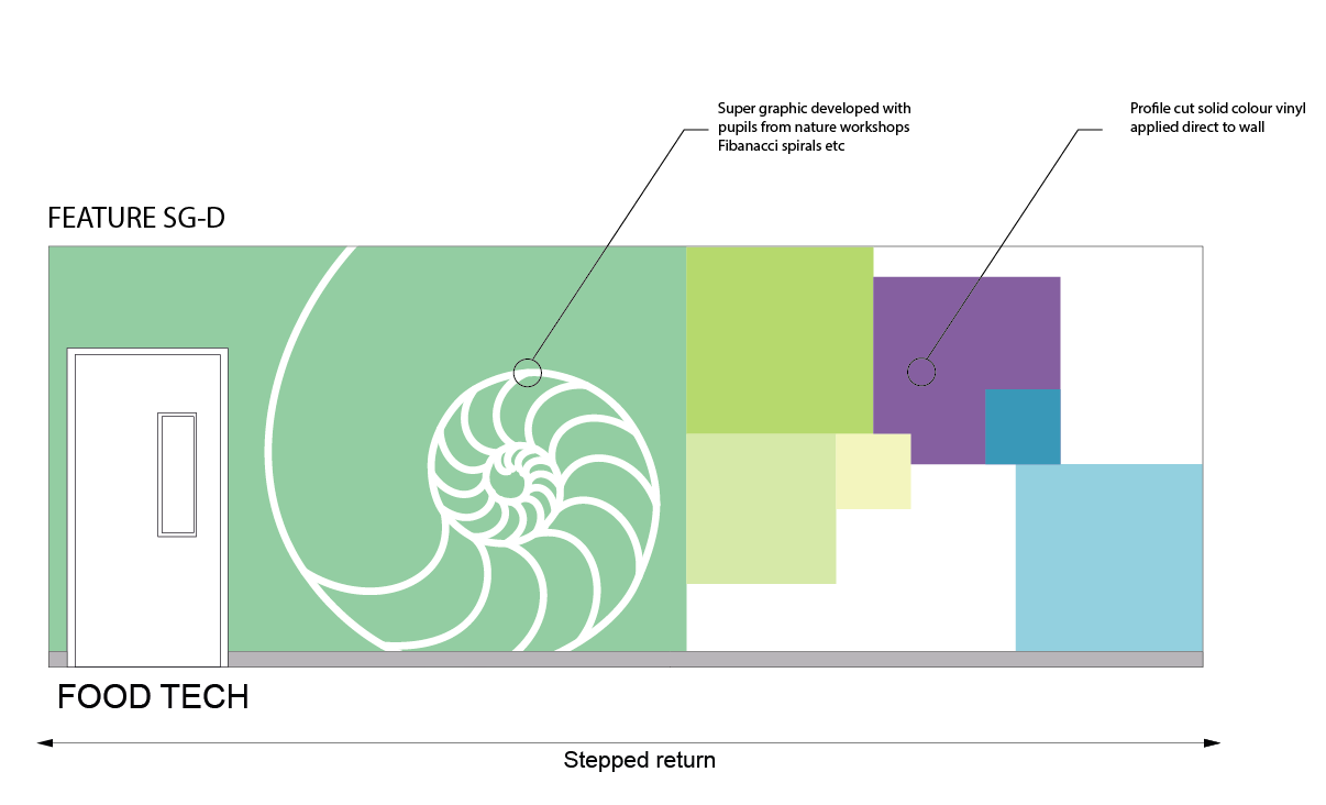
The Fibonacci series (0, 1, 1, 2, 3, 5, 8, 13, 21, 34…) is a numeric sequence that occurs in many living things, plants especially. Phyllotaxy, or the spacing of plant leaves, branches and flower petals (so that new growth doesn’t block the sun or rain from older growth) often follows in the Fibonacci series. Related to the Fibonacci series is the Golden Mean (or Golden Section), a ratio of 1:1.618 that surfaces time and again among living forms that grow and unfold in steps or rotations, such as with the arrangement of seeds in sunflowers or the spiral of seashells.

Biomorphic forms and patterns have been artistically expressed for millennia, from adorning ancient temples to more modern examples like Hotel Tassel in Brussels (Victor Horta, 1893) and the structures of Gare do Oriente in Lisbon (Santiago Calatrava, 1998). More intriguing still is the architectural expression of mathematical proportions or arrangements that occur in nature, the meaning of which has been fodder for philosophical prose since Aristotle and Euclid. Many cultures have used these mathematical relationships in the construction of buildings and sacred spaces. The Egyptian Pyramids, the Parthenon (447-438 BC), Notre Dame in Paris (beginning in 1163), the Taj Mahal in India (1632–1653), the CN Tower in Toronto (1976), and the Eden Project Education Centre in Cornwall, UK (2000) are all alleged to exhibit the Golden Mean.

As designers we’re seeing the possibilities of implementing these ideas in lots of areas. This is being increasingly supported by manufacturers such as Interface, manufacturer of flooring products, who’ve been championing Biophilia in their product ranges for some time.

For finishes in general these areas can include;

• Fabrics, carpet, wallpaper designs based on Fibonacci series or Golden Mean

• Window details: trim and mouldings, glass colour, texture, mullion design, window reveal detail

• Installations and free-standing sculptures

• Furniture details

• Acoustic paneling (wall or ceiling)

• Wall decal, paint style or texture

At a larger scale many designers are looking at;

• The arrangement of the structural system (e.g., columns shaped like trees)

• The building form

• Railings, banisters, fencing, gates

• Window details: frit, light shelves, fins

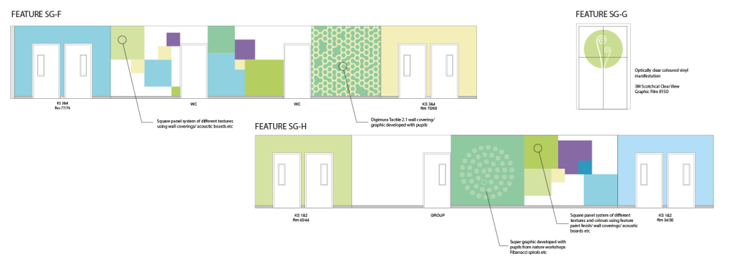
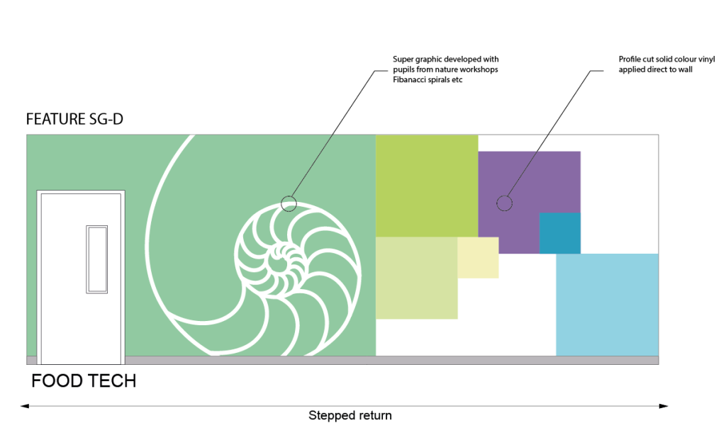
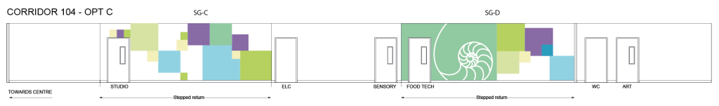
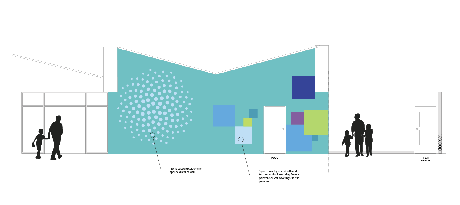
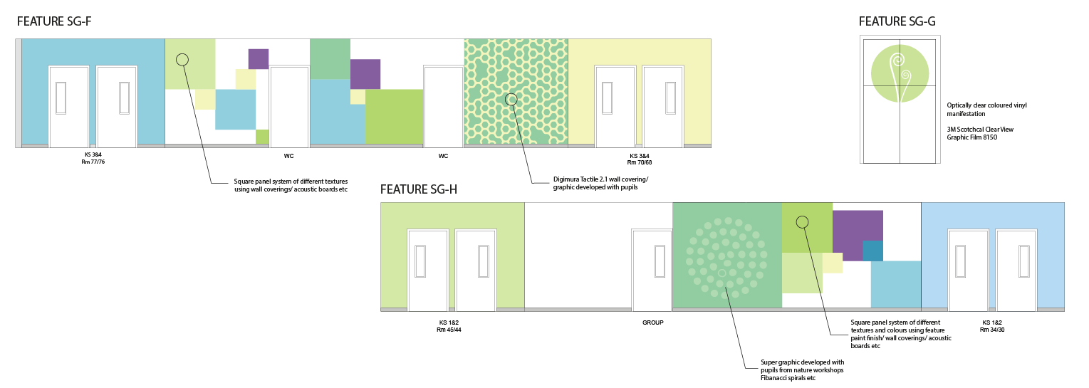
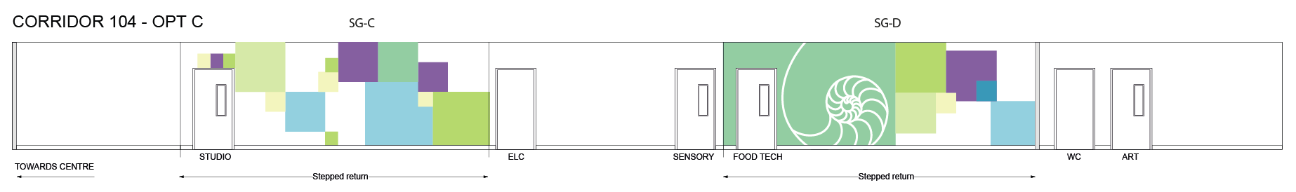
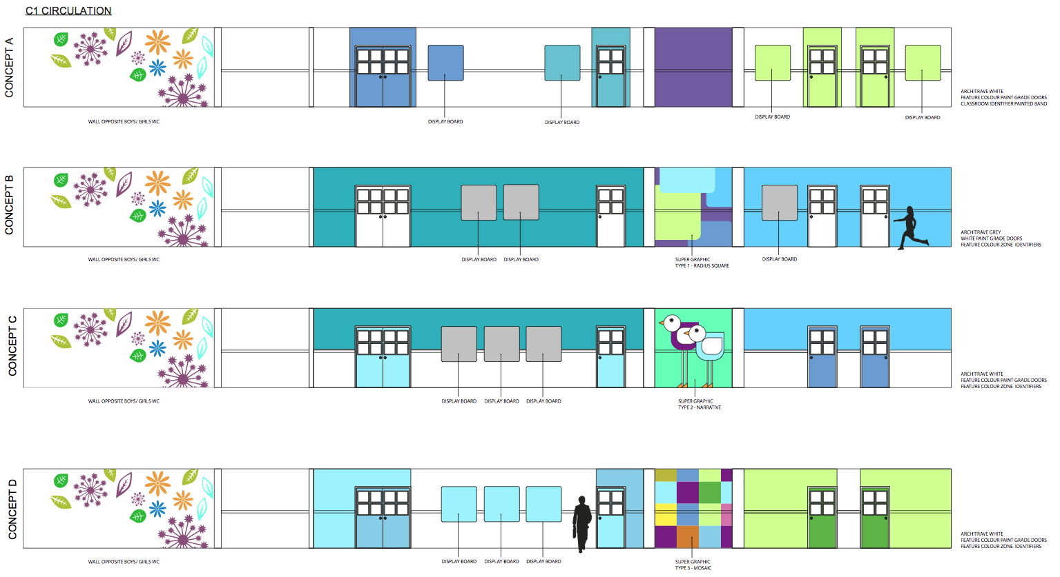
We’re currently working on an interior scheme for a new build special school in Leicestershire. Part of the wayfinding strategy is to zone areas of the building with super graphics. These patterns are based on natural mathematical forms found in nature and are being expressed as large super graphic applied on walls around the building. One of the reasons for using this approach aside from the natural theme benefits it will bring to the building is that recent studies have shown that children on the autism spectrum are good at recognising pattern.

Brain regions associated with recognising patterns tend to light up more in autistic people than the general population, perhaps explaining why those with autism often excel at visual tasks.

A new study published in the journal ‘Human Brain Mapping’ says;

The studies provide evidence that people with autism tend to perform strongly on visual tasks , said researcher Laurent Mottron of the Centre for Excellence in Pervasive Development Disorders at the University of Montreal. Mottron goes on to say, “people with autism have larger visual activity, something that’s already known at a behavioural level to some extent”.

Researchers analysed 26 brain imaging studies that included 357 people with autism and 370 people without autism. In all imaging studies, regardless of the research design or task presented to the study participants, the temporal and occipital brain regions had increased brain activity compared with non-autistic people.

“It means that the autistic brain is reorganised, but it’s not reorganised in a disorganised way,” Mottron said. “It’s reorganised in the sense of favouring visual expertise.”

The studies focused on people with less severe autism. Autism spectrum disorders affect about 1 percent of children ages 3 to 17, according to the Centres for Disease Control and Prevention. Autism hinders people’s ability to sense social cues and interact normally with others.

The study results show that in order to improve symptoms of people with autism, “we have to do it in their way” by building on the natural properties of their brains, Mottron said.

Screen Shot 2016-04-05 at 12.33.09

Screen Shot 2016-04-05 at 12.32.16

Screen Shot 2016-04-05 at 12.31.42


Birkett House concepts

An explanation of the colour scheme at Ysgol Y Gogarth SEN

We were recently asked to provide a summary of the principles that we used in developing the color scheme at Ysgol Y Gogarth for a case study that Akzol Nobel are producing. Below is an excerpt from our report;

The starting point for the scheme was to develop a colour palette which drew inspiration from the surrounding external Welsh landscape with the proximity of the sea, coast and mountains all within eyesight of the new school. This was linked to the focus that the school had on encouraging their pupils to get involved in numerous outdoor activities including climbing, skiing and canoeing. On my first visit to the old school I was struck by the outward looking ethos of the school and its daily approach of encouraging physical interaction with the landscape of the area.

There was a parallel dialogue with the school about how the internal finishes would influence and contribute to positive interaction with their pupils. One particular concern was that the school wanted the Ground floor (the entry point at the start of the start of the school day) to be a place of calm especially for their Autistic spectrum pupils for whom discordant colours and abrupt floor transitions would pose issues.

Another consideration was the wide spectrum of abilities within the school including those pupils with visual impairment needs as well as low levels of literacy. These factors were important when thinking about wayfinding within the new building as the use of signage would be limited as a consequence whereas the use of visual cues such as colour and texture would be emphasized.

As a result of considering all these elements the school was zoned into distinct thematic areas of ‘Sea’ for the Ground Floor and ‘Mountain’ for the First Floor with the ‘Forest’ acting as the transition points between those zones. Externally a ‘Coastal’ theme was used to bind together the various outdoor elements. A palette of shades of sea blues was used on the Ground floor to help develop a sense of calm whilst on the First floor stronger shades of mountain greens and purples were used to emphasise the energy and seniority of pupils as they progressed through the school.

Another guiding principle for the colour scheme was that all the end users would benefit from the scheme having a strong visual logic. A sense of repetition would be used to help locate people as they moved around the spaces. For instance aside from the differentiation between the ground and first floors, the core spaces such as offices and medical rooms were allocated their own core colour scheme. This was replicated across all the floors and was done to help confirm the differences and transition from and between pupil and administration spaces.

The scheme used the principle of feature wall colours contrasted with Wiltshire White on non feature walls. The feature wall colours were used partly as a tool for wayfinding; blocks of colors which guided people through the building, and also as a way of defining the various zones of the school. Within the stairwells large 6m high composite images of birch trees photographed at different times of the year were used to transition between the Ground and First floor. The principle staircase used by most people throughout the day combined a strong feature wall colour with a polycarbonate wall with seaweed graphics. Colour was used here to pull people up the stairs and onto the next floor.

Attention was paid to sightlines within the building. Although a relatively deep plan building the architects were able to maximize views out of the building towards the landscape. How many schools have a view of the coast at the end of a corridor? This principle of creating visual events was bound into the wall colour scheme; block colours were used to provide ‘destinations’ and ‘signposts’ to other parts of the building.

Ysgol Y Gogarth

Ysgol Y Gogarth

Ysgol Y Gogarth

Ysgol Y Gogarth

Ysgol Y Gogarth

Ysgol Y Gogarth


Ysgol Y Gogarth

Ysgol Y Gogarth


Finding your way to Mount Grace

Mount Grace wayfinding

We’ve recently been appointed by Leicestershire County Council to develop the interiors for the Mount Grace/ Holliers Walk refurb primary school scheme. Its been interesting to reflect on the change in focus compared to schemes that we were delivering 10 years ago. Now wayfinding is the first thing that we develop alongside the colour palette. Conversations with the school about how the building will be used and the flow around the space are all key elements in creating a successful wayfinding scheme. Obviously in a primary school there isn’t much need for actual signage but using colour and graphics to zone areas is critical.

The initial elevations show some early thoughts but these will in time be developed much more fully into a coherent wayfinding scheme.